Tubby
A Travel Companion App for People with Visual Impairments
My Role
-
Design the user survey questions
-
Create user journey map
-
Create high-fidelity prototypes
-
Write sample dialog for the voice agent
-
Test the function of the voice conversational agent
-
Edit the presentation video
Tools
-
Figma
-
FigJam
-
CapCut
-
Zoom
-
Google Docs
Duration
Sep 2023 ~ Dec 2023
Skills
-
User Research
-
In-Depth Interview
-
User Journey Map
-
Hi-Fidelity Prototype
-
Wizard of Oz Testing
12,500,000 people with disabilities travel per each year.
85% of these people face barriers when traveling.
How Might We optimizing the travel experience for people with disabilities, especially individuals with visual impairments, by easing their physical and digital barriers?
Empathy
We used three main methods to empathize with our target users and understand their frustrations and needs during travel.
User Interviews
To gain insights from individuals with visual impairments and mobile disabilities regarding their travel experiences, we started by creating an interview script.
We successfully scheduled two interviews, one interviewee with visual impairment and the other with visual and motor disability.
We held one face-to-face interview and one online interview through Zoom.
Secondary Research
To gain a more comprehensive understanding, we choose to combine secondary research as a supplement resource. Our sources included youtube videos which introduce blind people’s daily lives, online articles, and research papers of disability groups’ travel barriers.

We organized our secondary research findings in FigJam file for further summarization and classification.
Competitive Analysis
We analyzed existing travel-related websites and divided these websites into four categories:
We checked the websites’ accessibility settings and if the websites are screen reader friendly.


Hotel part of the competitive analysis
Define
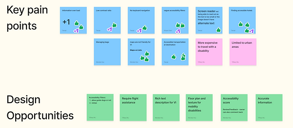
We voted among team members to identify the pain points that were most significant to our users in their online and offline traveling experiences.

We concluded six main pain points:
-
Information overload: Websites have a lot of irrelevant information like ads or complicated layouts that distract visually impaired users from the core task.
-
Inaccessible maps: maps are hard to use for visually impaired users.
-
Invalid screen readers: Screen readers and keyboard navigation are not fully applicable on some applications/websites.
-
Lack of accessibility information: Hotels do not openly display accessibility information which forces users to spend extra time fact-checking.
-
Vague accessibility filters: Accessibility search filters are not flexible enough and cannot fulfill disability users’ needs.
-
Inconvenient transportation: Travelers often have to spend extra time and money to find a safe, convenient, and accessible transportation method.
Based on these findings, we created a Persona for our travel companion app.

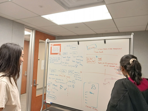
We mapped out the pain points onto the travel process to get a holistic view of what the user journey looked like. Through this process, we were able to refine and prioritize our focus.

We found that the frustrations faced by our users not only spanned the planning phase, but were also distributed in the whole travel process.
Before they start traveling, they need to book flights/hotels and make travel plan. After they arrive at the destination, they need to find accessible transportations.

Ideate & Prototype
In our ideation session, we had each team member brainstormed several sketches based on our user journey and core features.

Then, each of our team members made a paper prototype of the main user flows, include booking a flight, booking a hotel, adding a spot, and looking for a travel guide. We held a critique session and provided precious feedback for each other’s ideas.

Test & Iterate
