top of page
GlucoTrack
Simplifying Diabetes Management and Improves Patient Self-Care
My Role
-
Lead design workshop sessions
-
Design the user survey questions
-
Recruit interviewees and hold user interviews
-
Decide main functionalities
-
Create high-fidelity prototypes and presentation deck
Tools
-
Figma
-
FigJam
-
Google Sheets
-
Google Docs
-
Zoom
Duration
Jan 2024 ~ May 2024
Skills
-
User Research
-
User Flow
-
Wireframes
-
Hi-Fidelity Prototype
-
Usability Test
Why It's Important?
In recent years, the prevalence of diabetes, particularly type 2 diabetes (T2D), has surged to alarming levels, posing significant challenges to health systems worldwide.
While long-term health outcome of diabetic patients can be improve by appropriate self-management, current health record methods are often too complicated or not intuitive enough for the average user.
User Interviews

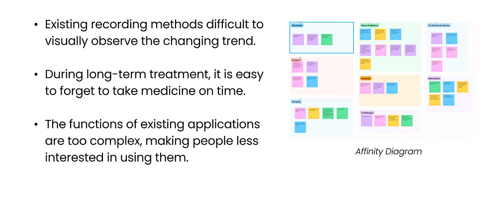
Key Insights
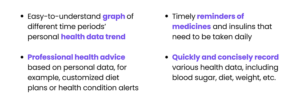
Needs
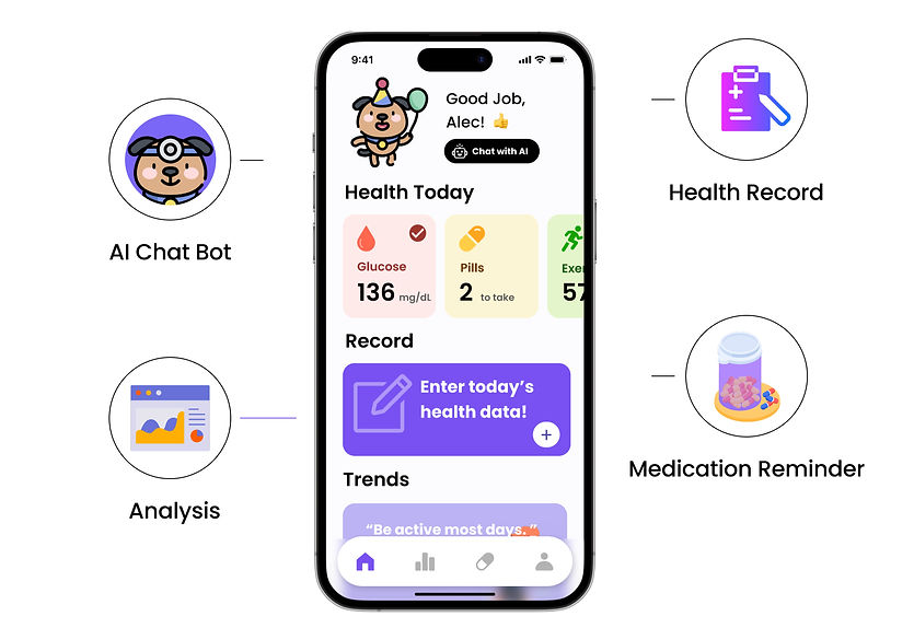
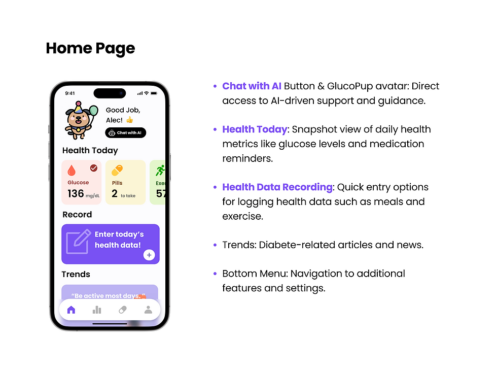
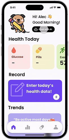
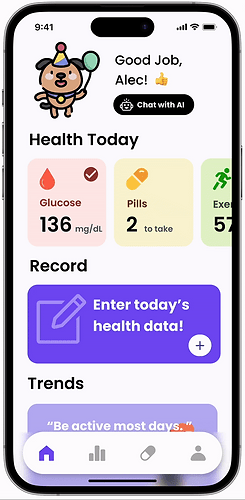
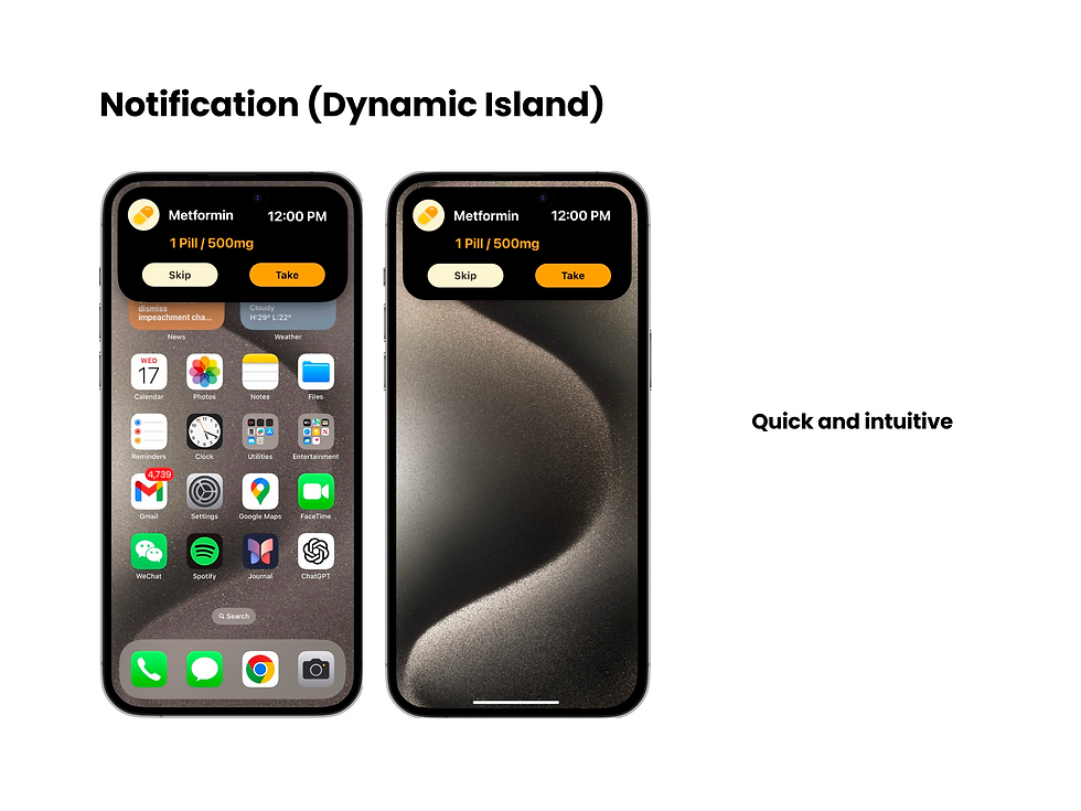
Our Solution
.png)


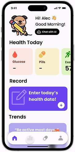
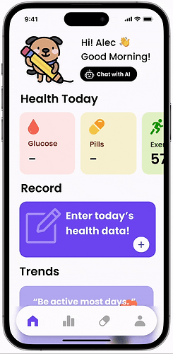
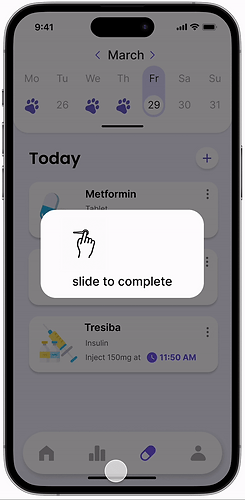

.png)
How did we get here?
Prototype Stages

Sketches

Mid-Fidelity and Round 1 User Test
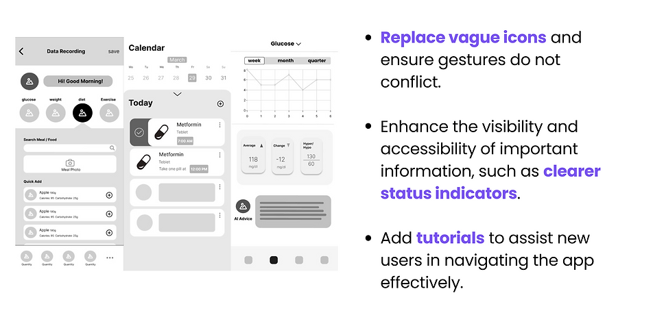
For mid fidelity prototype, we didn’t assign users with certain tasks but ask them for brief comments and feedbacks.
Round 2 User Test
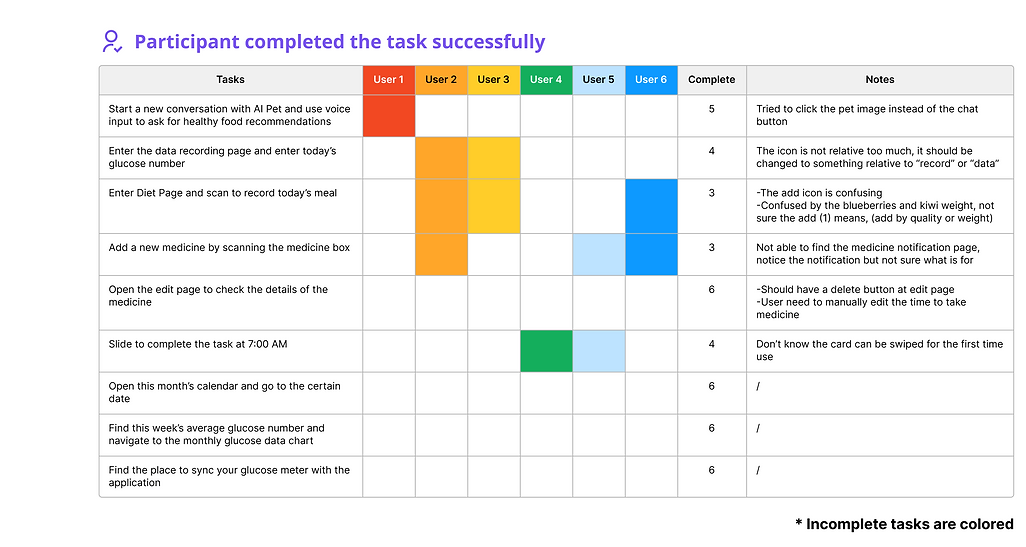
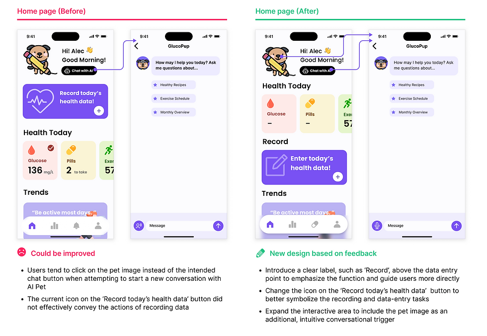
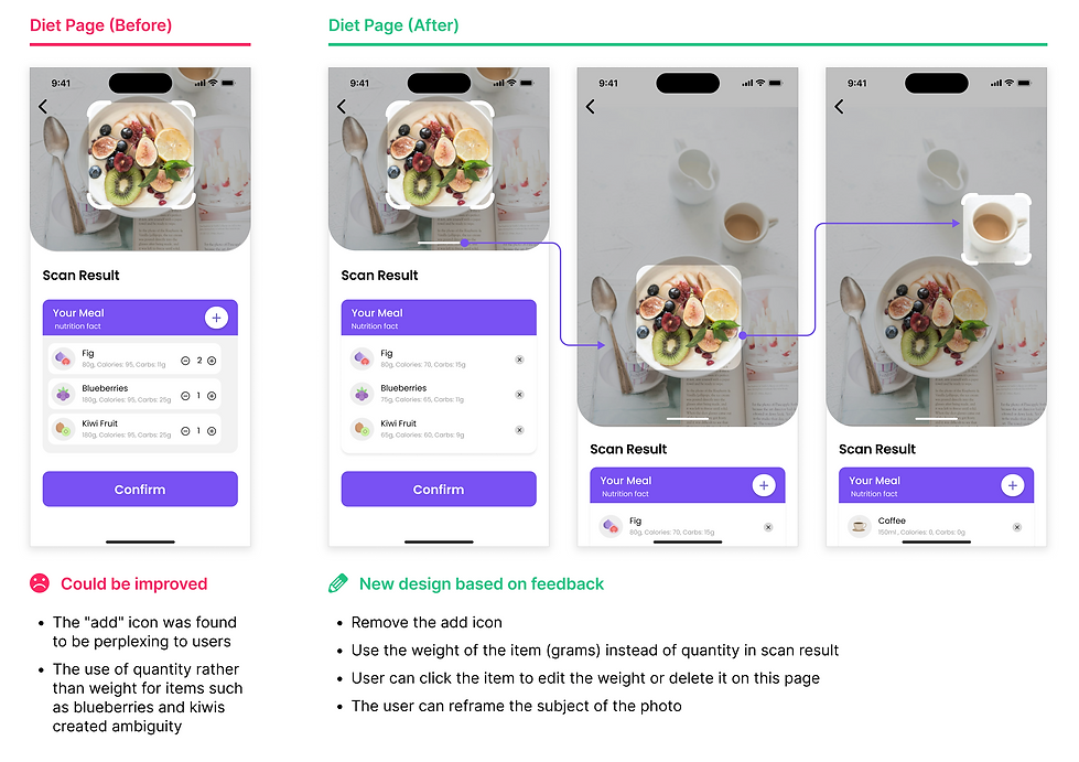
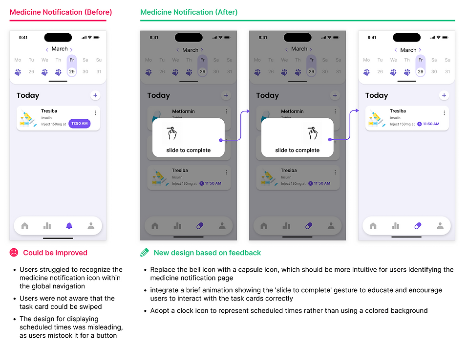
After finishing our first iteration of hi-fi prototype, we did a usability test with six participants. We crafted a set of tasks designed to walk users through the key features of the app, paying close attention to their natural interactions and any friction points encountered.
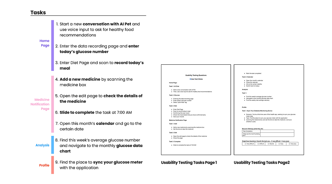
I marked the tasks that were not finished with the colored cells in the table, telling us where users encountered uncertainty or needed additional features. With each task, we took notes of their behaviors and feedback, which is helpful in refining our designs.
Iterations
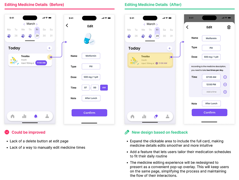
Final Usability Testing Outcomes
After our final round of user testing, we achieved an improvement in task success rate from 80% to 95%, with small suggestions provided by the users. The increased rate indicates that overall interactions within the application system were intuitive, resulting in better performance.
.png)
Lessons Learned
-
Try exploring different solutions and then narrow down to the key ones that address users' real needs.
-
Engaging directly with users is fundamental to user-centered design
-
Multiple iterations driven by user feedback help us ensure the effectiveness and usability of our design.
bottom of page